There is a small HTML attribute that most developers have never used. It solves one of the most persistent accessibility problems on the web. And it has been available in every major browser since April 2023.
It is the HTML inert attribute.
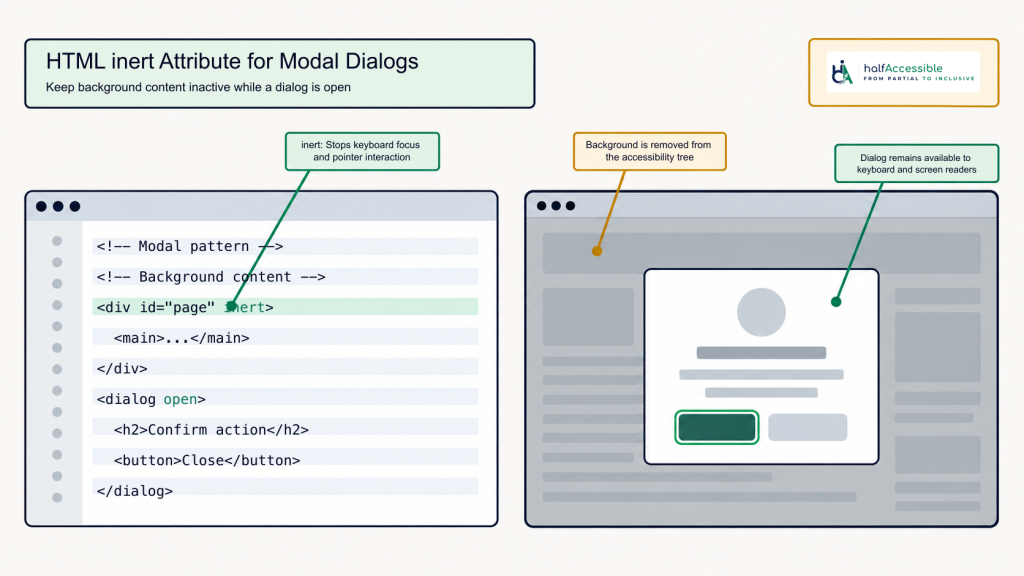
If you have ever built a modal dialog, a slide-out navigation drawer, or a loading overlay, you know the focus management problem. When a modal opens, keyboard users should not be able to tab into the content behind it. Screen reader users should not be able to browse that background content at all. But getting this right without the inert attribute requires three separate techniques applied carefully across multiple elements. Get any one of them wrong and you have an accessibility failure.
The HTML inert attribute replaces all of that with a single Boolean attribute added to a container element. This guide covers exactly what it does, how it compares to the old approach, when to use it, and what to watch out for.
Key Takeaways
- The HTML inert attribute is a Boolean attribute that makes an element and all its descendants non-interactive and invisible to assistive technology.
- It became Baseline Newly Available in April 2023, when Firefox 112 joined Chrome, Edge and Safari, and is now Baseline Widely Available, so it works in all major browsers without a polyfill.
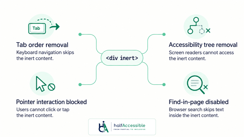
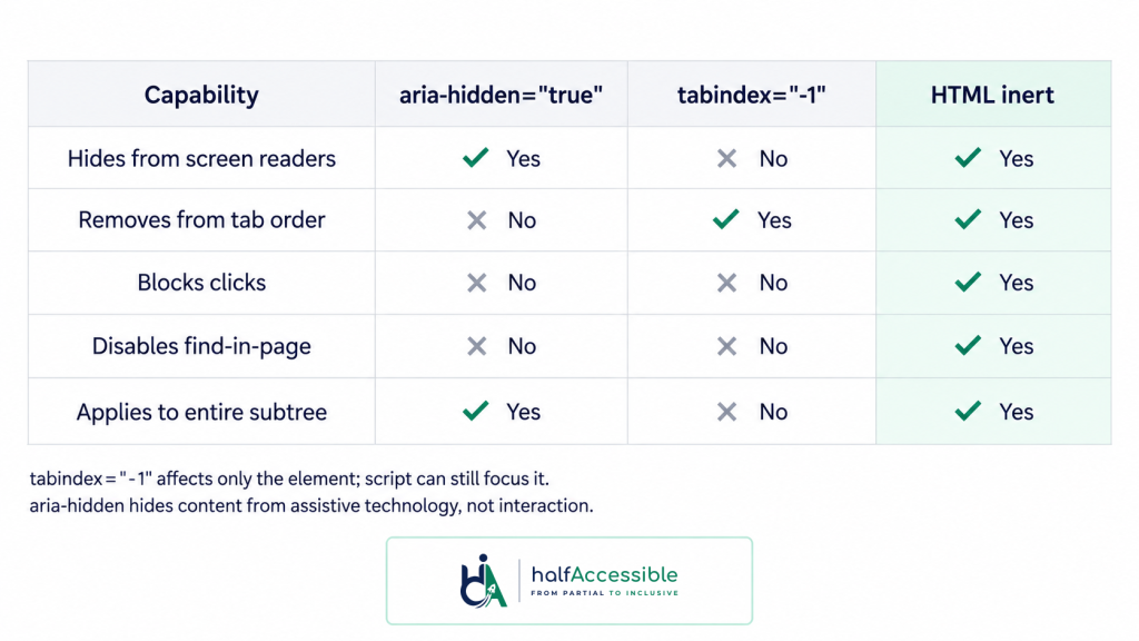
- It does four things at once: removes elements from the tab order, hides them from the accessibility tree, blocks all pointer and click events, and disables browser find-in-page within the inert subtree.
- The native
<dialog>element withshowModal()applies inert automatically to everything outside the dialog. You do not need to add it manually when using the native dialog element. - It is more reliable than manually combining
aria-hidden="true",tabindex="-1", and click-blocking overlays, which can each leave different gaps. - You must always provide a visual indicator that inert content is inactive. The attribute does not apply any default visual styling.
- Common use cases include modal dialogs, offscreen navigation drawers, carousels with non-visible slides, loading states, and conditional form sections.
What Is the HTML Inert Attribute?
The HTML inert attribute is a global Boolean attribute introduced in the HTML specification to give developers a native way to make sections of content non-interactive. You can apply it to any HTML element.
When added to an element, it makes that element and every single one of its descendants behave as if they do not exist for interaction purposes. Buttons inside an inert container cannot be clicked. Form fields cannot receive focus. Links cannot be followed. Screen readers skip the entire subtree.
Here is the simplest possible example:
<div inert>
  <button>This button cannot be clicked or focused</button>
  <a href="/page">This link cannot be followed</a>
</div>
The browser does all the work. No JavaScript event listeners. No manual tabindex management. No ARIA attributes needed on each child element.
The official MDN reference for the inert attribute describes it as a Boolean attribute indicating that the element and all of its flat tree descendants become inert.
What It Actually Does: Four Effects in One Attribute
Understanding exactly what the HTML inert attribute does matters because each effect addresses a different accessibility gap.
Effect 1: Removes from the tab order
Every focusable element inside an inert container is skipped when the user presses Tab. This includes buttons, links, inputs, textareas, selects, and anything with tabindex=”0″. The user cannot reach any of them through keyboard navigation.
Effect 2: Hides from the accessibility tree
Screen readers build a virtual representation of your page from the accessibility tree. When an element is marked inert, it and all its descendants are removed from that tree. A screen reader user browsing with arrow keys in virtual cursor mode cannot discover or interact with the content.
Effect 3: Blocks all pointer and click events
Click events do not fire on inert elements. Pointer events are suppressed. The user cannot interact with inert content using a mouse, touchscreen, or any other pointer device.
Effect 4: Disables browser find-in-page and text selection
This is the one that surprises most developers. When content is inert, the browser’s built-in Ctrl+F (or Cmd+F) find feature will not match text inside it. The user also cannot select and copy text from inert content. This prevents a separate but related problem where a screen reader user could find and land on content that appears accessible via find but is not actually meant to be interacted with.
Browser Support and Baseline Status
The HTML inert attribute became Baseline Newly Available in April 2023, when Firefox 112 shipped it after Chrome and Edge 102 and Safari 15.5. It has since passed the 30-month mark and MDN now lists it as Baseline Widely Available, so it is safe to use without a polyfill in any modern project. You can check current support on Can I use.
Specific availability by browser:
- Chrome and Edge: supported from version 102 (May 2022)
- Firefox: supported from version 112 (April 2023)
- Safari: supported from version 15.5 (May 2022)
If you are supporting browsers before these versions, a JavaScript polyfill maintained by WICG is available (web.dev’s inert explainer covers when you might still need it). For the vast majority of production projects in 2025 and 2026, native support is universal.
You can also control inertness through JavaScript via the HTMLElement.inert DOM property:
// Make a section inert programmatically
document.getElementById('sidebar').inert = true;

// Remove inert when the sidebar opens
document.getElementById('sidebar').inert = false;
HTML Inert Attribute vs aria-hidden vs tabindex=”-1″
This is the comparison most developers need before they adopt the HTML inert attribute. Each of the three approaches solves a different part of the problem, and combining them manually is where bugs tend to appear.
aria-hidden=”true”
This attribute removes an element and its descendants from the accessibility tree, hiding it from screen readers. But it does not affect tab order, does not block click events, and does not disable find-in-page. If you apply aria-hidden="true" to a container but leave a button inside it, a keyboard user can still Tab to that button. Their screen reader announces nothing when they land there because the element is hidden from the accessibility tree. The user is now in an invisible location with no way to orient themselves. As Deque University documents, this is a real and common failure pattern.
tabindex=”-1″
This attribute removes a single element from the sequential tab order. It does not hide content from screen readers, does not block click events, and does not affect child elements. You would need to apply it individually to every focusable descendant, which is error-prone and breaks when new interactive elements are added to a section.
The old combined approach
Many developers patch the gaps by using aria-hidden="true" on a container plus tabindex="-1" on every focusable child plus a transparent click-blocking overlay. This is fragile. Adding a new focusable element to the container later breaks the tab management. Forgetting to update aria-hidden when content becomes active again breaks screen reader access. The click overlay can interfere with other layout elements.
The HTML inert attribute
One attribute on the container handles all four effects simultaneously. It is atomic: either the entire subtree is inert or it is not. There is no partial state that can leave an accessibility gap. As the web.dev article on inert explains, using inert replaces what previously required three separate techniques.
Five Real-World Use Cases
The HTML inert attribute applies to any situation where content is in the DOM but should be completely off-limits to users.
1. Modal dialogs
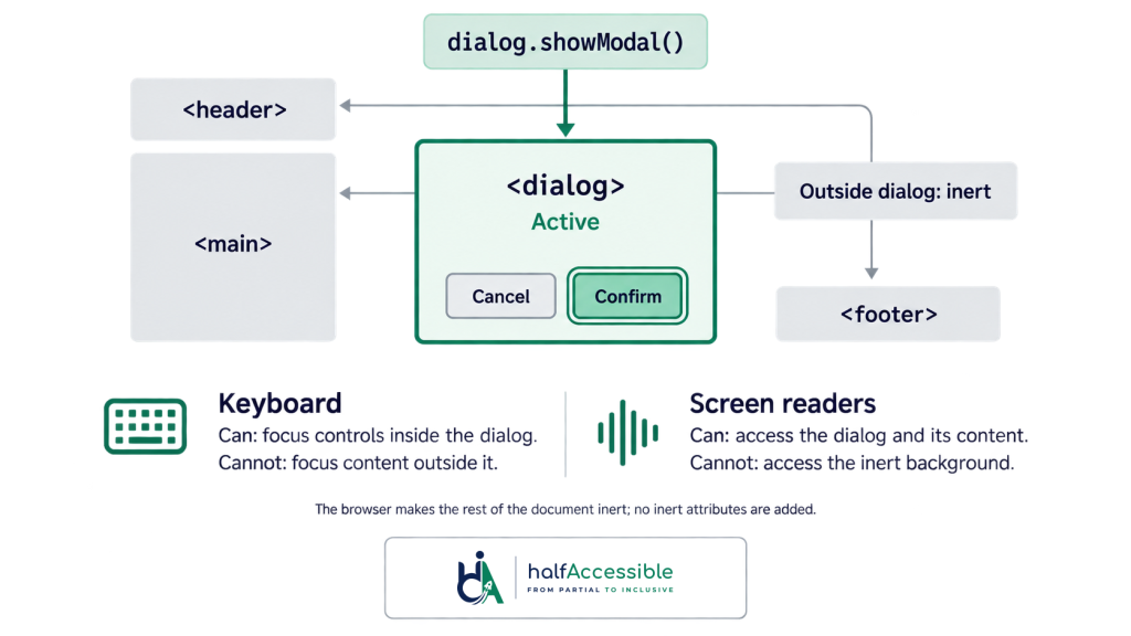
This is the primary use case. When a modal opens, all content outside the modal should be made inert. The user’s focus stays inside the dialog. Keyboard navigation cannot escape to the page behind it. Screen reader virtual browsing is limited to the dialog.
<!-- When modal opens, add inert to the page content behind it -->
<main inert>
  <!-- all page content here -->
</main>

<dialog open>
  <!-- modal content here -->
</dialog>
2. Offscreen navigation drawers
A slide-out navigation drawer that is translated off-screen with CSS is still in the DOM. Keyboard users can Tab into it even when it is visually hidden. Adding inert when the drawer is closed prevents this entirely.
<nav id="drawer" inert>
  <!-- navigation links -->
</nav>
When the user opens the drawer, remove inert and move focus to the first item. When they close it, add inert back and return focus to the trigger button.
3. Carousels and tabbed content
In a carousel, only the active slide should be reachable. Slides that are visually off-screen should not be in the tab order. Apply inert to all non-active slides and remove it from the active one.
4. Loading and submission states
When a form is submitting or a page section is loading, the UI is visible but should not be interactive. Apply inert to the form or section during the async operation. This prevents double-submissions and stops keyboard users from interacting with fields while data is processing.
5. Conditional form sections
When a checkbox like “Same as billing address” is checked, the shipping address section becomes irrelevant. Apply inert to the shipping address section to remove it from keyboard navigation and screen reader access without removing it from the DOM.
For more patterns involving keyboard navigation and focus control, the WCAG 2.2 Accessibility Scenario Learning Hub has free interactive scenarios covering focus management across 690 exercises.
Code Examples: How to Use It in Practice
Here is a complete modal implementation using the HTML inert attribute:
<!-- Page structure -->
<main id="page-content">
  <h1>Page Title</h1>
  <button id="open-modal">Open dialog</button>
</main>

<dialog id="my-dialog" aria-labelledby="dialog-title">
  <h2 id="dialog-title">Confirm action</h2>
  <p>Are you sure you want to proceed?</p>
  <button id="confirm">Confirm</button>
  <button id="cancel">Cancel</button>
</dialog>
const dialog = document.getElementById('my-dialog');
const pageContent = document.getElementById('page-content');
const openBtn = document.getElementById('open-modal');
const cancelBtn = document.getElementById('cancel');

openBtn.addEventListener('click', () => {
  dialog.showModal();          // opens modally: the rest of the page becomes inert automatically
});

cancelBtn.addEventListener('click', () => {
  dialog.close();              // background is restored automatically
  openBtn.focus();             // explicit return of focus to the trigger
});

// For a custom div-based modal (no showModal), set inert yourself:
// pageContent.inert = true;  on open
// pageContent.inert = false; on close
With a native <dialog>, showModal() makes everything outside the dialog inert for you, and the element already has the dialog role and modal behaviour, so it does not need role="dialog" or aria-modal="true" (the first rule of ARIA: do not add ARIA that native HTML already provides). For a custom modal built from a div, set inert on the background before opening it and remove it after closing. Either way, return focus to the trigger button so keyboard users know where they are.
For manual keyboard accessibility testing, the key checks are: Tab should stay inside the open dialog, Escape should close and restore focus to the trigger, and screen reader virtual cursor browsing should not reach the background content.
HTML Inert Attribute and the Native Dialog Element
If you are using the native <dialog> element with dialog.showModal(), you get inert behavior on background content automatically. The browser applies the inert state to everything outside the dialog when it is opened in modal mode. You do not need to add the inert attribute manually.
This is one of the strongest arguments for using the native dialog element rather than a custom div-based modal. Focus management, scroll locking, keyboard handling, and accessibility tree isolation are all handled by the browser. The MDN dialog element reference covers the full behavior.
Custom modal implementations built on divs do not get this behavior automatically. For those, you need to apply inert yourself to the background content when the modal opens.
The Accessibility Warning You Must Read
The HTML inert attribute does not apply any visual styling. When you mark content as inert, nothing changes visually by default. Sighted users can still see the content. It looks fully interactive.
This is a problem.
If a user can see what appears to be a button but cannot click it because it is inert, that is a frustrating and confusing experience. WCAG has no single success criterion for this, but MDN’s accessibility guidance is clear that inert content should look different from active content so sighted users understand why it does not respond.
You must visually distinguish inert content. Common approaches:
Overlay: Place a semi-transparent overlay on top of the inert area, typically the scrim behind a modal dialog.
Opacity reduction: Apply reduced opacity to indicate the section is inactive. This is useful for conditional form sections where the fields are present but greyed out.
CSS targeting: Use the :not([inert]) selector or directly style [inert] subtrees. Note that CSS does not currently have a native way to style based on inherited inertness, so you may need to add a class alongside the attribute.
Example:
/* Style the container that has inert applied */
[inert] {
  opacity: 0.4;
  pointer-events: none; /* redundant with inert but explicit */
}
MDN’s accessibility concerns section for inert specifically notes that developers are responsible for providing clear visual indication of inertness.
HTML Inert Attribute and WCAG Compliance
The HTML inert attribute helps you meet several WCAG 2.1 and 2.2 success criteria when used correctly. It is defined in the WHATWG HTML standard, and W3C documents the modal pattern in technique H102: creating modal dialogs with the HTML dialog element.
WCAG 2.1.1 Keyboard (Level A): All functionality must be available through a keyboard interface. Modals and drawers that allow focus to escape to background content fail this criterion. Applying inert correctly ensures keyboard users cannot leave the intended interaction zone.
WCAG 2.1.2 No Keyboard Trap (Level A): The user must be able to move focus away from any component using keyboard alone. A correctly implemented inert pattern prevents focus from leaking into the background without trapping the user inside the dialog. There must always be a way out (Escape key or a visible close button).
WCAG 2.4.3 Focus Order (Level A): If a web page can be navigated sequentially, the focus order should make sense. Allowing Tab to skip into visually hidden or background content breaks this. Inert prevents the problem at the source.
WCAG 2.4.11 Focus Not Obscured (Minimum) (Level AA in WCAG 2.2): A focused element must not be entirely hidden by author-created content such as sticky headers or overlays. This is easier to meet when focus is contained within the intended area and cannot land on background elements sitting behind a modal.
For a full accessibility audit that tests keyboard and screen reader behavior across all these criteria, our accessibility audit services include manual testing of focus management patterns. Automated tools like Axe catch some inert-related failures, but most focus management bugs only surface during real screen reader testing.
Understanding how attributes like inert relate to broader ARIA practices is covered in our guides to aria-label and ARIA attributes in general. If you are new to ARIA, start with our ARIA essentials quick-start guide; for how names and roles are exposed to assistive technology, see WCAG 4.1.2 Name, Role, Value; and if your modals live in a React app, our accessible React development team can help.
Common Mistakes to Avoid
Mistake 1: Not returning focus after removing inert
When you remove inert from a background section (e.g., after closing a modal), you must also move focus back to the element that triggered the interaction. If focus is left inside the now-closed dialog, it falls to the body element and keyboard users lose their place in the page.
Mistake 2: Applying inert without visual indication
As covered above, inert content looks identical to active content unless you explicitly style it differently. Always pair the attribute with a visual change.
Mistake 3: Using inert on the body element itself
Applying inert to <body> or <html> makes the entire page non-interactive, including the modal or dialog you are trying to show. Apply it to specific sibling containers, not parent wrappers.
Mistake 4: Confusing inert with hidden
inert and hidden are not the same. The hidden attribute removes an element from the rendering entirely. inert keeps it visible and rendered but non-interactive. Use hidden when content should not be rendered at all. Use inert when content should remain visible but not accessible to interaction.
Mistake 5: Forgetting to remove inert after the interaction ends
If you apply inert when a modal opens and forget to remove it when the modal closes, the entire page background remains non-interactive. Always pair your inert-on with an inert-off in the close handler.
Mistake 6: Assuming inert replaces ARIA roles
The HTML inert attribute manages interactivity. It does not add semantic meaning. A custom, div-based modal still needs role="dialog", aria-modal="true", aria-labelledby, and aria-describedby to give screen readers the context they need (see the ARIA Authoring Practices modal dialog pattern). A native <dialog> provides the role itself and only needs an accessible name and, where useful, a description. Inert handles the background. ARIA handles the foreground.
For more on managing ARIA correctly alongside native HTML attributes, see our guide on aria-expanded.
The Bottom Line
The HTML inert attribute is one of the most useful accessibility improvements added to the web platform in recent years. It solves a category of focus management bug that was previously difficult to fix reliably without JavaScript and multiple ARIA attributes.
If you are building modals, drawers, carousels, or any UI pattern where content needs to be visible but non-interactive, inert is the right tool. One attribute, four accessibility effects, full browser support.
The key things to remember: always pair it with a visual change so sighted users know the content is inactive, always remove it and restore focus when the interaction ends, and do not mistake it for a replacement for ARIA roles and labels on your active content.
If you are not sure whether your current modal and focus management implementations are accessible, our accessibility audit services test these patterns with real keyboard and screen reader users. The automated accessibility testing tools catch some gaps, but focus management issues like these almost always require manual testing to surface reliably.